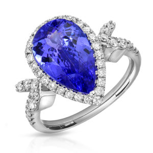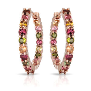
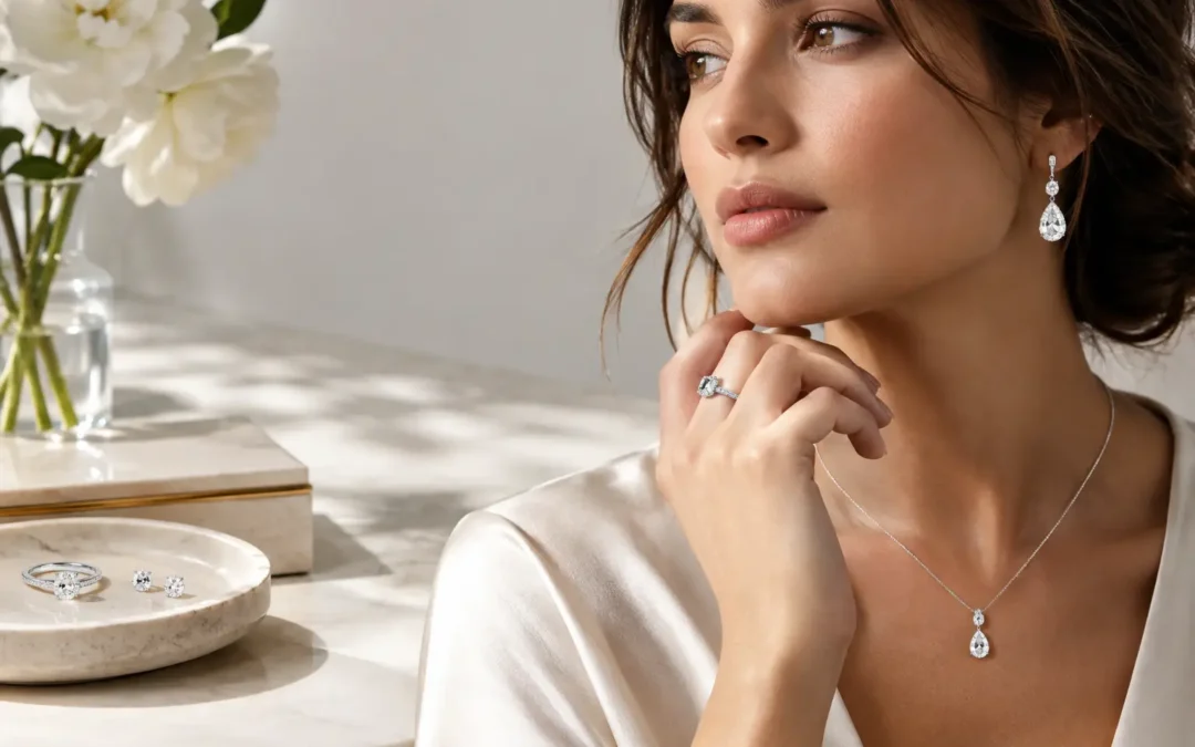
A diamond can be technically sharp and still look flat. A gold ring can be perfectly exposed and still feel inexpensive. That gap is where fine jewelry art direction does its work. It turns a set of product photographs into a coherent visual experience that shows craftsmanship, establishes value, and gives shoppers a reason to stop scrolling.
For fine jewelry brands, art direction is not decoration added after the shoot. It is the set of decisions made before the first frame: how metal should reflect, which facets need to catch light, what color background supports the collection, whether a hand model is needed for scale, and how every image will work across a website, campaign, and marketplace listing.
What Fine Jewelry Art Direction Actually Includes
Fine jewelry art direction connects a brand's visual identity to the practical realities of jewelry photography. It determines the mood of the images, but it also protects product accuracy. A campaign for sculptural yellow-gold jewelry may call for warm shadows, clean stone surfaces, and close crop details. A bridal collection may need brilliant diamond sparkle, airy styling, and images that feel refined rather than overly dramatic.
The best direction begins with the collection itself. We look at metal color, gemstone cuts, setting height, design references, price point, target customer, and where the images will be used. A necklace intended for an editorial launch needs a different treatment than the same necklace photographed for a white-background product page.
Art direction also creates rules. Those rules may cover background tones, shadow density, crop proportions, prop materials, model styling, retouching standards, and the balance between detail shots and full-product views. With those decisions established early, a collection can grow without losing its visual identity.
Start With the Sales Channel, Not the Mood Board
A beautiful mood board is useful, but it cannot replace a production plan. The first question should be: where will these images appear?
On an e-commerce product page, shoppers need to judge color, proportion, finish, clasp placement, and stone detail quickly. White-background catalog images should be clear, consistent, and close enough in scale that browsing feels effortless. Artistic lighting can support the brand, but it should never obscure the product.
For a campaign, the goal shifts. A campaign image can create aspiration, introduce texture, or place jewelry in a recognizable world. Here, art direction may include custom surfaces, expressive hand poses, wardrobe, beauty styling, and a more selective use of focus. The image does not have to explain every feature at once because the product page will do that work.
Marketplace photography sits between those needs. Amazon, Etsy, and other sales platforms reward clarity, while strong secondary images help a seller differentiate. A practical approach is to create a reliable white-background set first, then add on-model, detail, or lifestyle frames for brand and social use.
| Image Type | Primary Job | Best Use |
|---|---|---|
| White-background product image | Show accurate product detail | Product pages, wholesale, marketplaces, catalogs |
| Macro detail image | Prove craftsmanship and stone quality | Fine jewelry pages, launch materials, paid ads |
| Hand or model image | Show scale and personality | E-commerce, social media, campaign assets |
| Lifestyle campaign image | Build desire and brand recognition | Website banners, lookbooks, ads, editorial content |
| 360-degree video | Show dimension, movement, and finish | Product pages for statement pieces, watches, and high-value items |
Lighting Must Make Precious Materials Look True
Jewelry is not photographed with one generic lighting setup. Diamonds, colored gemstones, polished metal, brushed finishes, pearls, and watches all respond differently to light. Fine jewelry art direction tells us what visual result matters most, then the lighting is built to achieve it.
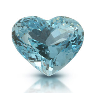
Diamonds need controlled contrast to show brilliance and facet definition without turning into featureless white flashes. Colored gemstones require especially careful color management. A sapphire that photographs too dark, a ruby pushed too magenta, or an emerald with excessive glare can create disappointment when the item arrives. We use jewelry-specific macro lighting to reveal liveliness while preserving the character of the stone.
Metal needs equal attention. Polished gold and platinum reflect everything around them, including the camera, studio walls, and light sources. The challenge is to create clean, intentional highlights that describe a ring's curves without making the surface look dull or artificially mirrored. A bright, high-key look may suit accessible everyday jewelry. A deeper, sculpted reflection can better support a luxury collection. Neither is automatically right. It depends on the brand, the finish, and the shopper's expectation.
Styling Should Support the Piece, Not Compete With It
Props can create context, but they can also make jewelry feel dated or distract from the design. Fine jewelry often benefits from restraint: stone, silk, brushed metal, glass, natural texture, or a carefully chosen color field. The prop is there to reinforce the collection's point of view, not to become the subject.
Scale is another styling decision with direct commercial value. A close-up of an engagement ring can reveal exceptional craftsmanship, but it does not tell a customer how the ring sits on a hand. Earrings, bracelets, and necklaces benefit from model imagery because fit and proportion influence purchase confidence. For pieces with a strong emotional or fashion component, a hand model can also make the collection feel lived in without requiring a full lifestyle production.
Model selection and posing deserve the same rigor as product lighting. The hands must be well groomed, gestures should feel natural, and poses need to leave room for the jewelry to read clearly. Overly theatrical styling may fit a fashion-forward campaign, but it can work against a heritage or bridal brand seeking timelessness.
Retouching Is Where Consistency Is Protected
Retouching should refine what the camera captured, not invent a product that does not exist. In fine jewelry, that means removing dust, fingerprints, scratches, temporary setting wax, distracting reflections, and minor manufacturing imperfections while retaining believable metal texture and stone characteristics.
Over-retouching is a common problem. Diamonds can lose their facet structure, gemstones can look plastic, and gold can become a flat yellow shape with no dimension. Accurate retouching preserves the difference between polished and brushed surfaces, respects gemstone color, and keeps pavé settings crisp. It should make the jewelry look meticulously presented, not digitally rebuilt.
Catalog consistency matters just as much as the quality of a single hero image. When each ring is photographed at a different angle, crop, brightness, or shadow level, a collection can look fragmented. A defined art direction system lets customers compare products easily and gives the website a more established appearance.
Build an Art Direction Brief Before Production
A clear brief saves time, prevents reshoots, and makes a larger content plan easier to price. It does not need to be complicated, but it should answer the questions that shape the shoot:
- What is the collection's visual personality: classic, modern, romantic, architectural, bold, or minimal?
- Which channels need assets, and what crop sizes do those channels require?
- Which pieces need on-model scale, macro details, or video?
- Are there existing images that the new production must match?
- What must remain absolutely accurate, such as gemstone color, engraving, finish, or clasp construction?
For established businesses, matching an existing catalog can be more valuable than creating a new look. For a designer launching a first collection, the opportunity is to create a visual system that can support future releases. The right choice depends on whether the immediate priority is continuity, repositioning, or speed to market.
A Practical Production Plan for Growing Collections
Not every brand needs a large campaign set for every SKU. A smart approach is to invest where imagery has the greatest sales impact. Hero pieces, new launches, higher-priced designs, and products with difficult-to-understand proportions often deserve extra angles, model photography, or motion content. Core catalog pieces may only need strong, consistent white-background views.
In our Los Angeles Jewelry District studio, we help clients build that balance. A fine jewelry collection may receive carefully directed campaign images alongside clean e-commerce files. A manufacturer or high-volume seller may prioritize repeatable catalog standards, professional retouching, fast turnaround, and qualifying volume pricing starting at $12 per image when applicable. Both projects need jewelry-specific skill. They simply need different levels of creative production.
Local clients in Downtown Los Angeles and throughout Southern California can work with us directly, while brands nationwide can send collections through our mail-in photography service. Before production, we can discuss references, sample images, required angles, file specifications, and how the finished work should perform across your sales channels.
A strong visual direction gives every image a job. If you are preparing a collection launch, improving an underperforming product catalog, or need refined campaign assets for high-value pieces, request a free quote and bring the jewelry into focus before it reaches the customer.