A buyer can decide whether to step into your booth in the few seconds it takes to walk past it. That is why jewelry trade show banner design cannot be treated like an enlarged business card. Your banner has one job before a conversation begins: make the right person stop, understand what you sell, and want a closer look.
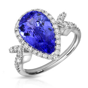
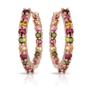
For jewelry brands, that first impression depends heavily on imagery. Fine chains, diamond settings, gemstone color, metal texture, and tiny details can disappear in a busy convention hall if they are not photographed and designed for the format. A beautiful banner is not simply decorative. It gives your collection a stronger presence, makes your booth easier to remember, and supports the sales conversation waiting inside.
Start With the Viewing Distance, Not the File Size
A banner viewed from 15 feet away needs a different design than a product page viewed from 15 inches away. Trade show aisles are visually crowded: neighboring displays, overhead lights, signage, people, cases, and competing color palettes all fight for attention. If the main message and image only work when someone stands directly in front of the banner, the design is doing too much.
Start by deciding what a passing buyer should recognize at a glance. Usually, that is your brand name, a collection category, or one clear positioning statement such as fine colored gemstone jewelry, custom bridal, made-in-Los-Angeles designs, or wholesale silver essentials. Keep that message short enough to read while walking.
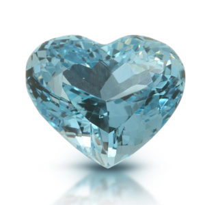
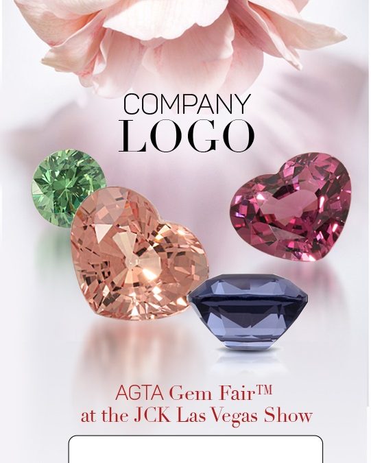
Then choose an image with a clear focal point. A close crop of a statement ring, an elegant necklace on a model, or a richly colored gemstone can create a stronger signal than a collage of 12 products. A busy catalog-style layout may show more inventory, but it often loses the drama that gets a buyer to pause.
Use Jewelry Photography Built for Large Print
Jewelry photography must carry more weight on a banner than it does in a small online thumbnail. At large scale, every issue is visible: soft edges, inaccurate metal color, dust, uneven reflections, poor masking, or gems that look flat instead of lively. Starting with a low-resolution web image and enlarging it for print can turn a polished collection into a fuzzy backdrop.
Use high-resolution, professionally retouched source files with enough detail for the final banner dimensions. Your printer can provide exact specifications, including bleed, safe areas, file type, and color profile. Those technical details matter, but the image itself comes first. It should show accurate material quality while still feeling aspirational.
For many brands, one of three image approaches works best:
- A hero product image works well for a signature piece, bridal collection, or gemstone with exceptional color and character.
- Jewelry on a model adds scale, movement, and personality. It is especially effective for earrings, necklaces, bracelets, and pieces whose appeal depends on how they sit on the body.
- A styled campaign image creates a larger brand world. This choice can suit designer collections, fashion-forward lines, and brands selling an emotional point of view along with the product.
- A refined product grouping can work for wholesale and retail brands that need to show range, provided the layout remains uncluttered and the pieces are large enough to read.
The right option depends on what you need the banner to communicate. A wholesale buyer may respond to clear category cues and product variety. A luxury retailer may be drawn in by a campaign image that signals craftsmanship, exclusivity, and a distinct design voice.
Let the Jewelry Be the Brightest Idea
Reflective products are easy to overdesign. A dramatic background, decorative typeface, multiple logos, metallic effects, and several product shots may all look exciting during the design process. On the show floor, they can compete with the jewelry instead of supporting it.
Give the hero piece room to breathe. Use contrast so its silhouette is clear, but avoid backgrounds so loud that stone color and metal finish get lost. White or soft neutral backgrounds can feel clean and premium for product-focused brands. Dark backgrounds can create richness and make diamonds or polished metals pop, but only when the photography has enough separation and controlled highlights.
If your collection is colorful, let the gems provide the color story. If the jewelry is minimal, a model image or a carefully chosen lifestyle setting may add the emotional energy the banner needs.
Build a Clear Hierarchy for Your Booth Banner
Strong jewelry trade show banner design follows the same visual order a buyer uses in real life. First they notice the image. Then they identify the brand. Then they decide whether the message is relevant to them. Finally, they look for a reason to engage.
Your logo should be visible without becoming the largest item on the banner. Oversized logos are common because brands want recognition, but an image-led banner generally attracts more attention from across the aisle. Place the logo where it is easy to find, then let the photography do the invitation.
Use one short supporting line if it sharpens your value. “Fine jewelry made for everyday brilliance” tells a clearer story than a paragraph about your company history. “Book a private showing” can work near the lower section of a banner when appointments are your primary goal. A booth number is helpful, especially on banners placed outside the main booth, but do not make visitors search for it.
Keep essential text away from the bottom edge. Retractable banner stands and furniture can hide low-positioned details. If your booth includes counters or display cases, stand in the aisle and check what remains visible at eye level. The best layout on a computer screen is not always the best layout in the hall.
Design a Banner System, Not a Single Sign
One banner can make an impact, but a coordinated set can guide visitors through your booth. Consider the roles each piece needs to play. A tall rear-wall banner can establish your brand image. A side banner can spotlight a collection or service. Smaller counter signage can explain materials, custom work, wholesale terms, or appointment options once someone is already engaged.
Consistency matters more than making every banner identical. Use the same photography style, color direction, logo treatment, and type choices so the booth feels intentional. Then give each banner a focused job. Repeating the same image and message on every surface wastes valuable visual space.
This approach is particularly useful when you sell multiple categories. A brand with bridal, colored gemstones, and fashion jewelry does not need to squeeze all three stories onto one panel. Let the main banner express the overall brand, while secondary pieces make the collection structure easy to understand.
Avoid the Most Expensive Banner Mistakes
The costliest mistake is printing before testing the design at realistic scale. Zoom out on screen, print a small proof, and view it from across the room. Can you identify the product type? Read the brand? Feel the intended price point? If not, simplify.
Another common problem is choosing a beautiful image that is wrong for the banner shape. A horizontal campaign photo may require awkward cropping for a narrow vertical stand. Plan the photography with the final format in mind, or select images with enough clean space for type and flexible cropping.
Be careful with tiny product shots. A full collection lineup can be useful at a sales meeting, in a lookbook, or on a digital display. On a banner, thumbnail-sized jewelry rarely creates enough impact. Show fewer pieces at a more persuasive scale.
Finally, do not rely on generic stock lifestyle imagery when the goal is to build trust in your actual collection. Buyers want to see the quality, design language, and materials they may carry or purchase. Original imagery gives them a more credible reason to step closer.
Plan Photography and Printing Early
Banner design works best when photography, design, and production are planned together. If you need a model shoot, decide whether the crop should leave space for your logo and message. If you need gemstone close-ups, discuss how those images will be used at large scale. If your show is approaching quickly, prioritize one hero banner over several rushed designs.
A jewelry photography specialist can help you create high-resolution product images, model photography, and campaign assets that work across booth banners, printed collateral, social media, and your online store. At TN Connections, that means building imagery around the way your jewelry needs to be seen, from precise gemstone detail to the personality of a finished collection.
Before sending anything to print, ask one final question: would this banner make a buyer curious enough to walk over without being told what to notice? When the answer is yes, you have created more than a sign. You have created the first step in a better sales conversation.