A white background is the safest choice for most product pages, marketplaces, and wholesale catalogs, but it is not automatically the best choice for every piece. The best jewelry image backgrounds support the metal, stones, price point, and sales channel without competing for attention. A diamond engagement ring, a yellow-gold chain, and a colorful opal pendant can each need a different approach to look accurate and desirable.
For an effective jewelry catalog, background selection is part of the lighting plan, not an afterthought. It affects how shoppers perceive color, scale, polish, and value. It also determines whether a collection looks organized across a category page or uneven from product to product.
Start with the sales channel, not the trend
A background that feels luxurious on an editorial campaign may be a poor fit for an Amazon listing or a retailer’s product feed. Before a shoot, decide where each image will appear and what job it needs to do. Your primary product image should make the piece easy to inspect. Secondary images can create mood, show scale, or express the collection’s personality.
For a large e-commerce catalog, consistency usually produces better commercial results than a different creative concept for every SKU. Customers compare similar items side by side. Matching framing, background tone, shadow direction, and retouching help them focus on meaningful differences: carat weight, gemstone shape, metal color, and craftsmanship.
White backgrounds: the e-commerce standard
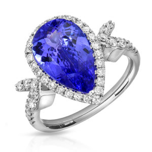
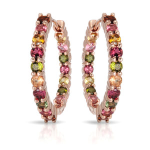
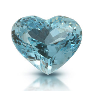
Pure white and near-white backgrounds remain the workhorse for jewelry photography. They keep attention on the piece, reproduce cleanly across web stores, and work well for marketplace requirements. White is especially practical for sterling silver, diamond jewelry, bridal collections, and everyday catalog pieces.
The challenge is that “white background” does not mean flat lighting. A white surface can make polished white gold, platinum, and silver disappear if the reflections are not carefully controlled. Diamonds can also lose separation when a bright background washes out their outer edges. The photographer has to build enough contrast into the metal and stone while preserving an honest, high-key presentation.
In our Los Angeles studio, we shape reflected highlights around metal edges and use jewelry-specific macro lighting to keep prongs, pavé, engraving, and faceting readable. Professional retouching then removes distracting dust and support materials while maintaining believable reflections. The goal is a clean image that still feels dimensional.
White is best when you need a consistent product catalog, marketplace-ready files, wholesale line sheets, or clean images for a new e-commerce launch. It is less effective when a very pale piece needs stronger edge separation or when a brand’s visual identity depends on a darker, more editorial look.
Light gray backgrounds: subtle depth without distraction
Light gray is one of the most useful alternatives to white. It creates a small amount of separation behind bright metals and colorless stones, often making a product feel more dimensional while remaining clean enough for a premium store or lookbook.
A soft gray background is particularly effective for platinum jewelry, white diamonds, pearls, and polished silver. The backdrop provides a controlled tonal difference, so the silhouette reads immediately. It can also make a catalog feel quieter and more refined than a stark pure-white page.
The trade-off is brand consistency. If your existing collection is photographed on white, introducing gray at random can make category pages look fragmented. For a relaunch or a new line, however, gray can be an excellent signature catalog treatment when used consistently.
Black and dark backgrounds: dramatic, but demanding
Black backgrounds make diamonds, gold, and high-polish metal feel dramatic. They are strong for luxury campaigns, evening jewelry, bold gemstone collections, and hero images used in banners, social media, or print. Dark backgrounds can also emphasize the outline of a light-colored piece in a way white cannot.
They require precision. Highly reflective jewelry mirrors everything around it, including a dark set. Without deliberate lighting, gold may turn muddy, gemstones may lose internal color, and black surfaces may reflect as unwanted bands in polished metal. A dark image must retain detail in both the shadows and the highlights.
Black is usually better as a campaign or secondary image background than as the only catalog style. A shopper should still have at least one clear, well-lit view that accurately shows construction, gemstone color, and fine details. For high-end brands, the most effective mix is often a clean e-commerce image paired with darker creative assets that establish the collection’s mood.
Colored backgrounds: use brand color with restraint
A carefully chosen colored background can make a collection recognizable before customers even read the product name. Soft blush, stone, deep green, warm cream, or a brand-specific color can support an editorial collection launch. Color also works well for jewelry designed around birthstones, enamel, seasonal palettes, or a youthful fashion customer.
The risk is color contamination. Gemstones and polished metals reflect nearby surfaces. A blue background may cool a diamond or silver bracelet. A warm beige surface can make a white stone appear yellow. Strong colors need controlled lighting and color-managed retouching so the jewelry itself remains accurate.
For this reason, colored backgrounds are usually best reserved for campaign, social, and website-banner images. If they are used for product pages, shoot a neutral reference image as well. That gives shoppers a trustworthy view of the actual stone and metal color.
Lifestyle backgrounds add scale and desire
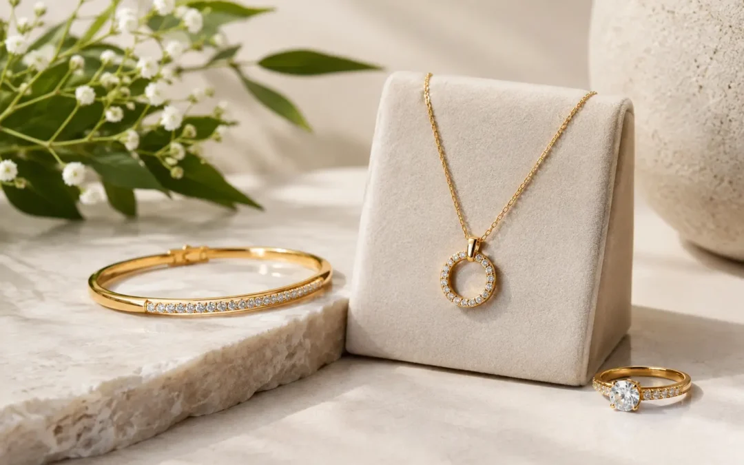
Lifestyle settings give jewelry context. A ring on a hand shows proportion. Earrings on a model reveal movement and how they sit near the face. A necklace photographed with wardrobe, skin tone, and a considered setting can communicate the customer, occasion, and price position far faster than a cutout alone.
The background should still serve the jewelry. Fine textures such as natural stone, silk, wood, or softly blurred architecture can add interest, but a busy surface steals attention from small details. This matters most for pieces with delicate chains, fine pavé, or subtle gemstone color.
For a luxury campaign, art direction may call for richer props and intentional contrast. For an independent designer selling direct to consumers, a few hand-model and lifestyle photographs can provide the emotional content that white-background product images cannot. Both approaches work best when the product image remains the visual priority.
Choosing the best jewelry image backgrounds by use
| Background | Best for | Main advantage | Watch for |
|---|---|---|---|
| Pure white | Product pages, marketplaces, catalogs | Clean, versatile, easy to compare | Bright metals and diamonds need edge definition |
| Light gray | Fine jewelry, silver, platinum, diamonds | Adds gentle separation and depth | May not match an existing white catalog |
| Black or charcoal | Luxury campaigns, social, hero banners | Drama and strong perceived value | Reflections and shadows can hide detail |
| Brand color | Collection launches, editorial, social | Creates recognition and personality | Color casts can alter stone appearance |
| Lifestyle setting | Campaigns, DTC stores, social content | Shows scale, emotion, and wearability | Props or scenery can overwhelm the piece |
Background choice is only half the image
Even the right backdrop cannot rescue poor jewelry lighting. Diamonds need controlled brilliance rather than random glare. Emeralds, sapphires, and opals need lighting that reveals their true color and internal character. Gold needs shaped reflections that describe its form without showing the studio in the surface. Every material responds differently.
Angles matter as much as the background. A ring often needs a straight-on hero angle, a three-quarter view, a side view to show the setting height, and close details for the shank or stone. Necklaces may need a laid-flat product image plus an on-model view for length and drape. When every item follows the same angle plan, customers can compare confidently and your catalog looks professionally built.
Retouching should refine the image, not invent a different product. Remove dust, thread, fingerprints, and distracting supports. Correct minor tonal inconsistencies. Preserve stone inclusions, metal texture, proportions, and accurate gemstone color when those details affect a purchase decision.
Build a background system, not a one-off shoot
The most practical approach for most jewelry businesses is a background system: one dependable catalog style, one premium secondary style, and a set of campaign images for launches or promotions. That gives your e-commerce store clarity without making the brand feel generic.
TN Connections photographs fine jewelry, commercial collections, diamonds, gemstones, watches, and volume catalogs from the Los Angeles Jewelry District, with nationwide mail-in service available for remote clients. We can match an established visual standard or create a repeatable image system that fits your brand, sales channels, turnaround needs, and budget. Request a free quote with a few sample pieces and your intended use, then choose backgrounds that make the jewelry easier to trust and harder to pass by.