A diamond ring can look flawless in a styled campaign image and still leave a shopper wondering what they are actually buying. They need to see the setting, metal color, stone shape, proportions, and fine details without visual distraction. That is the central decision in catalog photography versus creative imagery: one format makes buying easier, while the other makes the collection more desirable. Most jewelry businesses need both, but not in equal amounts or at the same point in the sales process.
At TN Connections, our Los Angeles jewelry photography studio plans these image types around the way a customer encounters a product - from a marketplace thumbnail or collection grid to a product-detail page, advertising campaign, or social post.
The Short Answer: Use Each Style for a Different Job
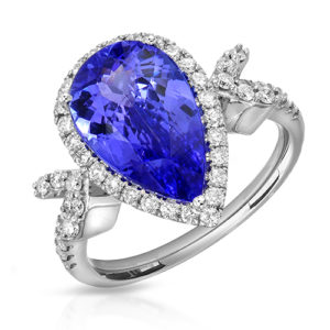
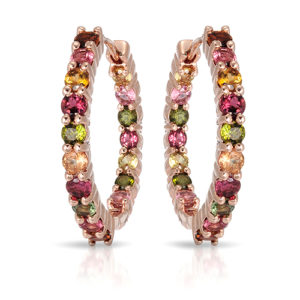
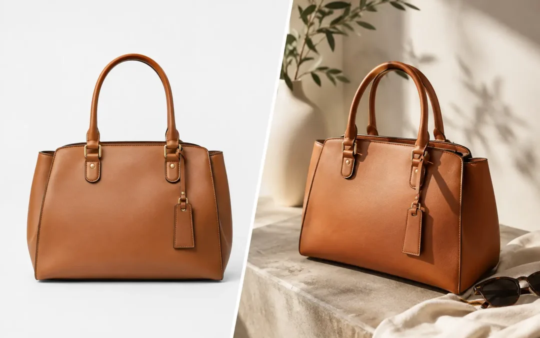
Catalog photography is the foundation of a jewelry store. It presents every piece in a clean, consistent, comparable format, usually against a white, light neutral, or transparent background. Its job is accuracy: show the product clearly, maintain consistency across a collection, and support confident online purchasing.
Creative imagery is built to create a feeling around the product. It may use artful shadows, colored surfaces, natural materials, close crops, models, hands, or a carefully directed setting. Its job is attention and brand recognition. A creative image can tell shoppers whether a collection feels architectural, romantic, understated, bold, vintage-inspired, or made for celebration.
The strongest approach is usually not catalog or creative. It is a catalog-first library supported by a smaller, more intentional set of campaign and lifestyle assets. A new Shopify collection, wholesale line sheet, or Amazon listing cannot rely on mood alone. On the other hand, a luxury launch shown only as isolated white-background pieces can struggle to create a memorable point of view.
What Catalog Photography Does Best
Catalog photography gives a collection order. When every pendant, bracelet, ring, and earring is photographed at a consistent scale, angle, background, and level of retouching, customers can browse quickly and compare pieces without hesitation.
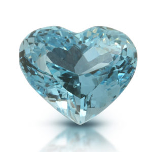
For jewelry, clean does not mean flat. White-background work requires highly controlled lighting. Polished gold and silver behave like mirrors, diamonds can go dark or overly contrasty, and colored gemstones can shift under the wrong light. We shape reflections in the metal, preserve diamond brilliance without creating false sparkle, and photograph stones so their color reads as naturally as possible on screen.
A proper catalog image also makes operational sense. It is adaptable for product-detail pages, marketplaces, retailer submissions, line sheets, email, and inventory-driven promotions. Consistent images are especially valuable for manufacturers, wholesalers, and brands with frequent product releases because new items can match an established visual standard.
Catalog photography is the practical choice when:
You are building or refreshing an e-commerce store, listing inventory on Amazon or another marketplace, sending a collection to wholesale buyers, or photographing dozens to hundreds of SKUs. It is also the right starting point for a brand whose existing product pages use inconsistent supplier images, phone photography, or mixed backgrounds.
For rings, multiple catalog views matter. A straight-on view can show the center stone and setting design, while side and three-quarter angles reveal profile, gallery work, shank details, and height. Earrings benefit from front and angled views. Necklaces often need a clean laydown image plus a worn image to clarify length and scale.
Where Creative Jewelry Imagery Earns Its Place
Creative imagery creates the pause that catalog photography cannot always create. It gives a customer a reason to look closer before they begin comparing specifications.
This format is particularly useful for launch campaigns, website banners, social content, lookbooks, seasonal promotions, paid advertising, and editorial outreach. It can also help distinguish a designer collection from visually similar competitors. A sculptural gold cuff photographed with directional light may communicate craftsmanship and confidence much more effectively than a standard product shot alone.
The key is restraint. Props, textures, and dramatic lighting should support the jewelry rather than compete with it. If a gemstone disappears into a dark composition or reflections obscure a polished surface, the image may be visually interesting but commercially weak. Fine jewelry photography should always protect the product's perceived quality.
In our studio, creative direction can range from subtle shadow play for a refined luxury brand to on-model and hand-model imagery that puts pieces into a real human context. Models are especially effective for showing scale, movement, styling possibilities, and personality. A pair of hoops looks different when a shopper sees their diameter against a face; a stack of rings becomes more convincing when the fit and proportion are visible on a hand.
Catalog Photography Versus Creative Imagery by Sales Channel
The right image mix depends heavily on where customers buy. A marketplace shopper is generally searching, comparing, and deciding quickly. A direct-to-consumer shopper may be discovering a brand through an ad or social post before ever reaching the product page.
| Sales use | Catalog photography | Creative imagery |
|---|---|---|
| Product-detail pages | Essential for clarity, angles, and close inspection | Supports scale, styling, and premium presentation |
| Amazon and marketplaces | Usually the primary requirement | Useful only where platform rules allow secondary images |
| Wholesale line sheets | Best format for consistency and fast buying decisions | Limited use for brand presentation pages |
| Website homepages and banners | Can work for a minimal product-led look | Strong choice for visual impact and collection storytelling |
| Paid social and email | Useful for product-focused offers | Often stronger for stopping the scroll and building emotion |
| Luxury launch campaigns | Needed for product pages after the click | Central to art direction and brand distinction |
The product page is where the two styles work together most effectively. Use the clean image first when clarity is the priority, then add close details, a side view, a scale image, and one or two creative or modeled frames. This sequence gives shoppers both evidence and aspiration.
Cost, Speed, and Production Trade-Offs
Catalog photography is generally more efficient to produce at volume because the lighting setup, camera position, background, and retouching standard can be repeated. Once a collection workflow is established, the studio can photograph a large assortment with reliable consistency. For qualifying volume projects, TN Connections offers pricing starting at $12 per image.
Creative imagery requires more variables: set design, props, surfaces, art direction, model coordination, styling, and additional lighting tests. It should cost more because it is a more custom production. That does not mean every creative project needs an elaborate set. A focused concept using the right surface, a controlled shadow, and excellent jewelry lighting can feel elevated without turning a product launch into a major campaign shoot.
Turnaround also depends on the brief. A standardized catalog is easier to schedule and scale. Creative work takes longer when approvals involve multiple stakeholders or when each shot needs a unique arrangement. Brands on a deadline often get the best result by shooting catalog images first, then selecting hero pieces for creative treatment.
Build an Image Plan Before You Send the Collection
Before a shoot, identify the images required by your sales channels and decide which pieces deserve campaign attention. Not every SKU needs the same creative investment. A core solitaire, a new signature pendant, a high-margin bracelet, or the leading piece in a collection may deserve more assets than a basic replenishment item.
For a typical jewelry launch, plan clean catalog views for every product, close-up details where craftsmanship or stones warrant them, and creative hero images for the pieces that will carry the campaign. Add on-model or hand-model photography when scale and styling will remove common shopper questions.
Accuracy should remain non-negotiable across every format. Retouching can remove dust, distracting reflections, minor scratches, and temporary production marks, but it should not misrepresent diamond size, stone color, metal finish, or construction. The goal is a polished representation of the piece a customer receives, not an image that creates disappointment after delivery.
Choosing the Right Mix for Your Brand
If you are launching an e-commerce catalog or photographing a large inventory refresh, put most of the budget into consistent catalog photography. It will support more channels, make merchandising easier, and give your business a dependable visual system. Add creative images around collection launches, key promotions, and products that need a stronger emotional introduction.
If you are a luxury designer brand with a defined visual identity, creative imagery may take a larger share of the production budget. Even then, do not skip the clean product views. High-value customers expect to inspect a piece closely before purchasing, and retailers need images they can use consistently.
Jewelry deserves photography that makes people feel something without making them guess. Request a free quote with your collection size, intended sales channels, and any existing image references, and we can help shape a practical shot list that sells now and supports the next launch.