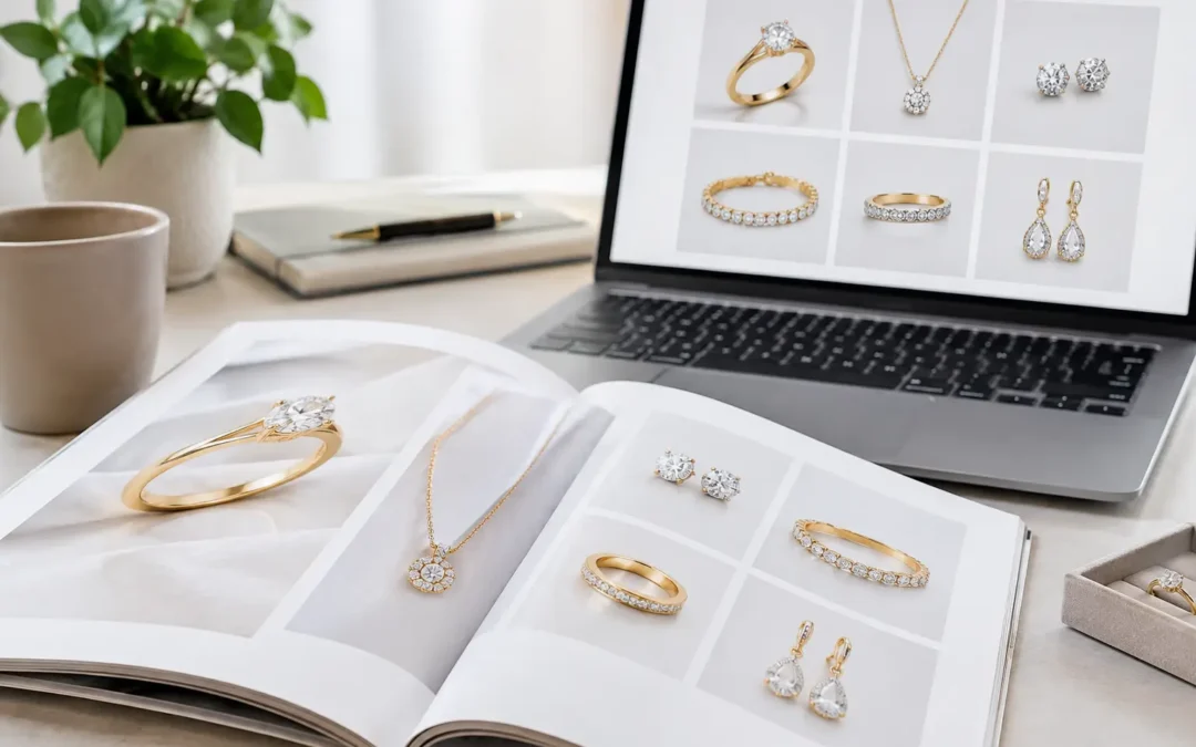
A jewelry catalog consistency case study is not really about making every ring, pendant, or bracelet look identical. It is about making every product feel like it belongs to the same brand while showing its true materials, proportions, and craftsmanship. For online jewelry stores, that consistency reduces shopper hesitation: customers can compare pieces quickly, recognize collection details, and trust that the product they receive will resemble the image.
In our Los Angeles studio, we see this problem most often when a growing jewelry business has photographed new products over several seasons. The pieces may be beautiful, but the catalog begins to feel uneven. One necklace has bright white metal, another looks gray. Stones shift from cool blue to greenish blue. Some rings are tightly cropped, while others float with too much empty space. The fix is not one preset or a single retouching pass. It is a controlled production system.
The Starting Problem: A Catalog That Did Not Compare Well
This representative case involved a fine-jewelry seller adding new diamond and colored-stone styles to an established e-commerce catalog. Their existing product images came from different shoots and photographers. Some were photographed against pure white, while others had a slightly warm background. Yellow gold appeared rich in one group and pale in another. Reflections across polished metal varied from soft and elegant to harsh and distracting.
The issue was especially visible on category pages. Individually, several images were usable. Together, they made the collection look less considered than the jewelry itself. Shoppers comparing similar designs could not easily judge stone size, metal tone, or the differences between a delicate everyday ring and a more substantial statement piece.
The business did not need campaign imagery for every SKU. It needed a dependable white-background catalog standard that could work for current products, future launches, wholesale line sheets, and marketplace listings. That distinction matters. A creative hero image can be intentionally dramatic. A catalog image must be dependable at scale.
What Consistent Jewelry Photography Actually Controls
Catalog consistency comes from repeatable choices made before the camera shutter is pressed. Retouching is essential, particularly for dust, minor scratches, fingerprints, and small distractions, but it cannot fully correct inconsistent lighting direction or a mismatched camera angle.
For this project, the photography direction centered on four areas: lighting, angles, scale, and color.
Lighting Diamonds, Gemstones, and Metal Differently
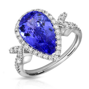
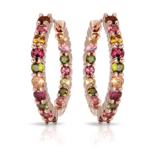
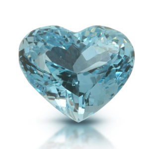
Jewelry is not one material. Diamonds need controlled sparkle and facet definition without becoming a field of blown-out white highlights. Colored gemstones need accurate hue and saturation while retaining internal character. Highly polished gold, platinum, and silver need clean reflection lines that describe form rather than reflect every studio surface.
We built lighting recipes by product type. A diamond solitaire ring needed a different balance of directional light and fill than a pavé hoop or an emerald pendant. The goal was not to force every piece into the same lighting pattern. The goal was to create an image family with a similar brightness, reflection quality, and sense of refinement.
This is where a general product setup often falls short. Jewelry-specific lighting lets the camera show metal edges, stone facets, and small construction details without making the product look overly sharp, dark, or artificial.
Establishing a Repeatable Angle System
Angle consistency is one of the fastest ways to make a catalog look intentional. We defined a primary front view for each category, then matched supporting views to the same visual logic. Rings were centered at a consistent tilt and crop. Earrings followed a shared spacing and orientation. Necklaces received a predictable chain arrangement and pendant placement.
A standard angle does not mean every item must be photographed from the exact same position. A halo ring may need a slightly higher view to show its center stone, while a band may need a lower profile to reveal engraving. The standard is the decision-making framework: show the feature that helps customers understand the piece, while preserving the catalog's overall rhythm.
For products with meaningful side details, we added profile or three-quarter views. A single front image may work for simple studs, but it is rarely sufficient for a ring with a raised setting, gallery work, or distinctive shank.
Matching Crop and Scale Without Misrepresenting Size
Inconsistent cropping quietly creates confusion. A petite pendant that fills the frame can appear larger than a heavier pendant shown with wider spacing. Likewise, a bulky ring photographed too close can feel disproportionate beside a delicate stacking ring.
We set crop guidelines by category and used measured visual spacing rather than guessing product by product. The product remained the clear focus, but every image had comparable breathing room. For designs where physical scale was a major buying factor, we recommended additional hand-model or on-model images. White-background photography supports comparison; model imagery gives customers context for wear and size.
Color Correction That Respects the Actual Piece
Color accuracy is particularly important for gemstones and gold. Overcorrecting can make a stone look more saturated than it is. Under-correcting can leave metal dull and diamonds gray. Neither serves a high-end brand or a marketplace seller trying to reduce returns.
The workflow included calibrated color review and consistent background cleanup. We corrected each image to represent the jewelry attractively and honestly, while preserving collection-level harmony. For colored stones, that can require a conversation with the client about which appearance is most faithful under normal viewing conditions. Some gems shift noticeably under different light sources, and a photograph should not promise a color that the stone cannot consistently deliver.
The Jewelry Catalog Consistency Case Study Workflow
The project began with a review of the brand's strongest existing images. Rather than copying every legacy image, we identified the visual decisions worth retaining: the preferred background white, metal brightness, shadow treatment, crop style, and degree of gemstone sparkle. We also identified what had to change to make future photography more consistent.
A small test group was photographed first. It included yellow gold, white gold, diamond, and colored-stone pieces across several categories. This step prevented an expensive mistake: applying one lighting setup to an entire collection before confirming how it handled different materials.
Once the client approved the test images, we documented the production standard. That reference covered camera orientation, crop ratios, lighting approach, product positioning, retouching level, file naming, and required deliverables. With a clear standard, later additions could be photographed months later and still sit naturally beside the original collection.
Professional retouching completed the process. We removed temporary distractions while keeping the jewelry believable: dust in macro views, uneven background edges, minor handling marks, unwanted reflections, and visible support materials. We did not reshape stones, change the construction of settings, or make metal finishes look unlike the actual product.
Where the Trade-Offs Belong
Perfect uniformity is not always the right goal. A luxury brand with sculptural, editorial designs may want a more expressive primary angle than a high-volume marketplace catalog. A gemstone dealer may prioritize close-up facet detail, while a fashion jewelry seller may need fast, clean images optimized for dozens or hundreds of SKUs.
The appropriate standard depends on sales channel, collection price point, and how customers evaluate the product. The table below shows the practical difference.
| Catalog Need | Best Photography Approach | Why It Works |
|---|---|---|
| Fine jewelry e-commerce | White background, multiple detail angles, high-end retouching | Supports material inspection and premium presentation |
| Amazon or marketplace listings | Clean white background, standardized crops, efficient angle set | Makes large catalogs easier to browse and manage |
| Wholesale collections | Consistent hero view plus detail images | Helps buyers compare styles quickly in line sheets |
| Designer launches | Catalog images paired with creative or model photography | Covers product clarity and brand storytelling |
For a large catalog, production efficiency also matters. Photographing every item with six elaborate angles may not be necessary. In many cases, a carefully chosen primary image and one or two supporting views provide the best balance of cost, speed, and shopper confidence. TN Connections offers volume pricing starting at $12 per image when applicable, with the final scope based on jewelry type, image count, retouching needs, and required angles.
Building a Standard That Lasts Beyond One Shoot
The strongest result from a consistent catalog is not just a cleaner website launch. It is a system the brand can use again. When a new collection arrives, the visual reference removes guesswork. The next batch can match the last one, even when it includes different metals, stone shapes, or product categories.
For Los Angeles Jewelry District clients, this can be reviewed in person with samples and existing products at our Downtown Los Angeles studio. For nationwide clients, a mail-in project can follow the same process through product intake, reference approvals, test photography, and final delivery.
If your catalog looks like it was built in separate chapters, start by selecting ten representative products and comparing them side by side on one screen. The gaps in lighting, crop, color, and angle become clear quickly. A focused photography standard can turn those gaps into a catalog that makes every new piece easier to trust, compare, and want.