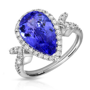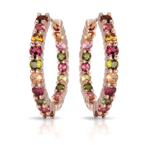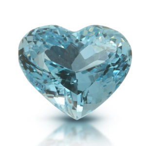
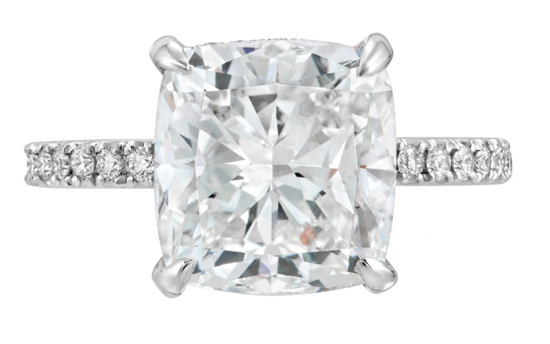
A shopper cannot feel the weight of a gold chain, turn a ring toward the light, or inspect a gemstone’s setting through a screen. Your images have to do that work. Strong jewelry catalog photography makes every product page feel clear, credible, and worth a closer look – whether you are selling a single custom piece or managing thousands of SKUs.
For jewelry brands, catalog images are not simply documentation. They are a sales tool. They show finish, proportion, gemstone color, clasp details, engraving, and craftsmanship at the exact moment a customer is deciding whether to trust your business. When images are inconsistent, dark, or overly edited, even a beautiful piece can look ordinary. When they are precise and polished, the product gets the attention it deserves.
What Jewelry Catalog Photography Needs to Accomplish
A catalog has one job: help customers understand what they are buying quickly and confidently. That means each image should answer practical questions without forcing the shopper to guess. Is the stone bright or included? Is the metal warm yellow gold or cool white gold? How substantial is the chain? What does the profile of the setting look like?
Jewelry is one of the most demanding products to photograph because it is small, reflective, and full of fine detail. Polished metal can mirror the camera, the studio, and every unwanted reflection nearby. Faceted stones need controlled light to show brilliance without becoming a white glare. Pearls need soft shaping. Matte finishes need texture. A professional process manages each material rather than using one lighting setup for everything.
The goal is accuracy with appeal. A ring should look luxurious, but it must still resemble the ring that arrives at the customer’s door. Overly dramatic color, heavy sharpening, or unrealistic sparkle may win a quick click, but it can also create returns and disappointment. Great catalog imagery makes the piece look its best while staying faithful to its materials and construction.
Consistency Is What Makes a Catalog Feel Premium
One excellent image cannot carry an entire online store. Customers move from product to product, compare options, and scan collection pages quickly. When angles, backgrounds, crop sizes, and lighting shift without intention, the catalog can feel disorganized. The brand loses polish before the customer has even read a product description.
Consistent jewelry catalog photography creates visual order. Earrings sit at a similar scale. Rings are framed with the same amount of breathing room. White backgrounds are truly clean and neutral. Metals retain believable color from one product to the next. This consistency helps shoppers compare pieces and gives retailers, marketplaces, and sales teams files they can use without rebuilding every listing.
That does not mean every image needs to look identical. Your core product images should follow a dependable standard, while selected hero pieces can receive more creative attention. A clean front view may be best for an e-commerce listing, while a detailed side angle can show the architecture of a halo setting. The key is to make those choices deliberately, not because the production process changed from one item to another.
The right angles depend on the piece
A simple pendant may need a full product view, a close-up of the bail, and an image that shows chain length. A ring often benefits from a top view, profile view, and close detail of the center stone or setting. Earrings may need front-facing images plus a view that explains their depth and closure. For complex or high-value pieces, additional views can reduce uncertainty and give shoppers a stronger reason to buy.
The right quantity depends on the product and where it will be sold. Marketplace requirements, website templates, and wholesale line sheets may all call for different crops or file formats. Planning these needs before the shoot saves time and helps avoid costly reshoots.
Lighting Should Reveal, Not Distract
The best jewelry lighting feels effortless to the shopper, even though it is highly controlled behind the scenes. Reflections are shaped to define polished metal. Diffusion is adjusted so diamonds and gemstones keep their character. Small changes in the position of a light can dramatically change the way a stone sparkles or the way a bracelet’s links separate visually.
There is a trade-off between bright, eye-catching imagery and accurate material representation. Too much direct light can create aggressive hotspots that hide the texture of metal and wash out gemstones. Light that is too soft may make a piece look flat and lifeless. Experienced jewelry photographers balance broad, clean illumination with precise highlights that give each surface dimension.
Gemstones require particular care. Sapphire, emerald, ruby, opal, and diamond all respond differently under studio light. A professional image should preserve the stone’s recognizable color and internal character while presenting it in a polished, sales-ready way. This is especially valuable for gemstone sellers and fine jewelry businesses, where small visual details can affect perceived value.
Retouching Is Part of the Product Presentation
Every high-end jewelry catalog requires retouching. Dust, fingerprints, tiny scratches, loose fibers, and minor reflection issues become very noticeable at high resolution. A piece that looks pristine in person can reveal dozens of distractions once it is magnified for a product page.
Professional retouching removes those distractions while protecting the truth of the item. The work may include cleaning backgrounds, refining metal edges, correcting unwanted reflections, balancing color, and preserving crisp gemstone detail. It should not turn a natural inclusion into a different stone, change metal color, or invent a level of sparkle the piece does not have.
This balance matters because jewelry buyers are observant. They zoom in. They compare images across devices. They may know exactly what a particular cut, gemstone type, or setting style should look like. Clean retouching supports trust; excessive retouching risks weakening it.
Build a Workflow That Keeps Products Moving
Catalog work becomes more efficient when photography is treated as part of your product workflow, not as a last-minute marketing task. Before shipping pieces or bringing them to a studio, organize items by SKU, collection, metal color, and image requirements. Make sure each piece is inspected and cleaned. Include notes for custom engraving, removable tags, chain lengths, or special angles that need attention.
For volume catalogs, a shot list is essential. It keeps approvals clear and makes it easier to confirm that every product has been photographed, retouched, and delivered in the right format. File names should connect directly to your inventory system whenever possible. A beautifully photographed image becomes less useful if your team cannot quickly match it to the right product listing.
Fast turnaround matters, particularly before a jewelry show, collection launch, seasonal promotion, or marketplace deadline. But speed should not mean rushing past quality control. The best production partners establish clear expectations for delivery, revision needs, and final file specifications before shooting begins.
At TN Connections Inc, catalog projects can be planned around individual pieces, full collections, or ongoing volume needs, with high-resolution retouched imagery designed for online selling and broader brand use. The process should feel personal and organized, not like your inventory has disappeared into a generic production queue.
Add Model and Lifestyle Images With Purpose
Catalog photography is the foundation, but it does not need to be the entire visual strategy. Model images, hand-model photography, and lifestyle banners help customers see scale, movement, and personality. A delicate necklace reads differently when shown on a model. A stackable ring collection becomes easier to imagine when displayed on a hand. These images add emotion that a white-background product shot cannot always provide.
Still, lifestyle imagery should support the catalog rather than replace it. A customer needs clean views to evaluate the product. They also need aspirational imagery to picture it in their own life. Combining both gives your brand the practical clarity of e-commerce with the visual energy of a campaign.
For smaller budgets, start by getting the core catalog right. Build a consistent set of product images first, then select bestsellers and new arrivals for model or creative work. For established collections, a larger visual mix can strengthen website banners, social posts, advertising, print materials, and launch campaigns.
Make Every Image Earn Its Place
Before approving a final catalog, view the images the way a shopper will. Check them on desktop and mobile screens. Make sure white backgrounds look clean, the metal color feels consistent, and important details remain visible when the image is reduced to thumbnail size. Confirm that crops work with your website layout and that the product is instantly recognizable from the first frame.
The most effective jewelry catalogs do not rely on tricks. They make it easy for customers to see the value already present in the piece. When every image is clean, consistent, and beautifully detailed, your products have a better chance to earn confidence before they ever reach a customer’s hands.