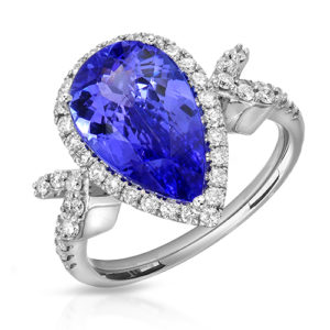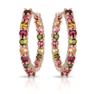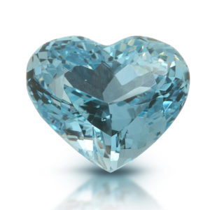
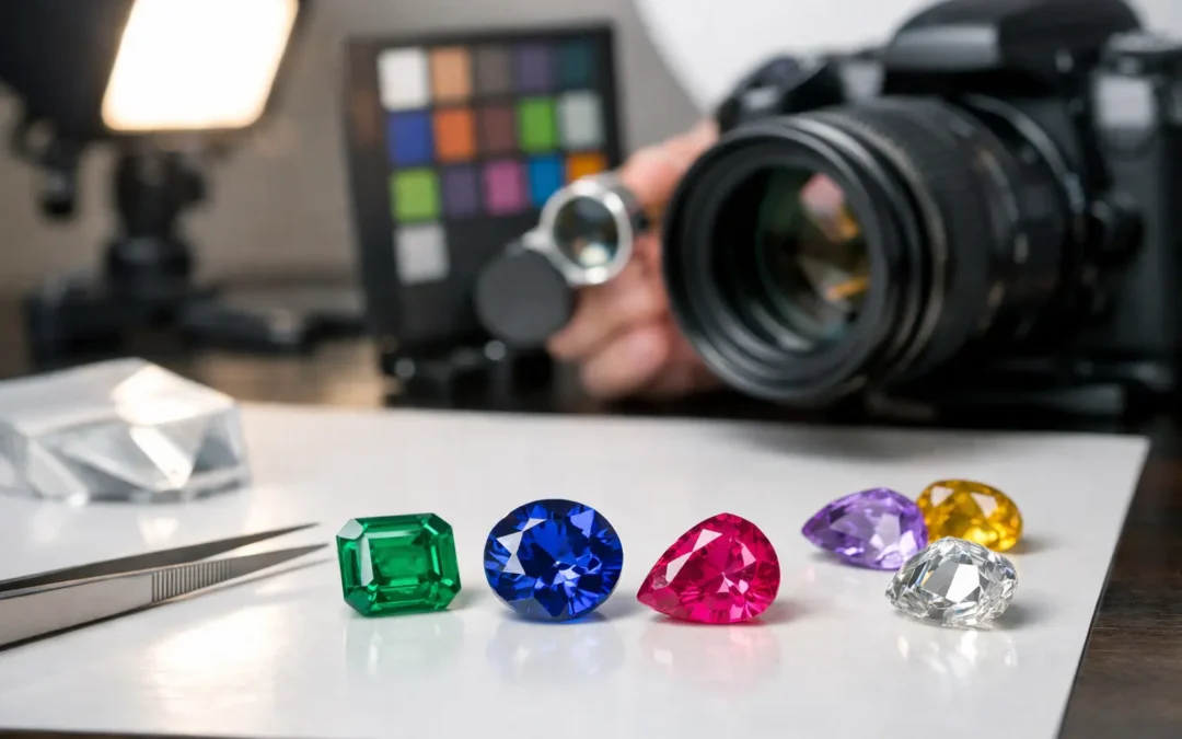
A sapphire that looks richly royal blue in person but nearly black online creates hesitation before a shopper ever reaches the product details. Gemstone color accuracy is not achieved by simply turning up the lights or increasing saturation. It comes from controlling the entire photographic process – lighting, camera capture, monitor calibration, retouching, and final file delivery – so the image represents the stone honestly while still showing its beauty.
For jewelry brands, designers, gemstone dealers, and catalog sellers, that balance directly affects returns, buyer confidence, and perceived value. A customer expects a fine emerald, spinel, tourmaline, or diamond to arrive looking consistent with the listing. The goal is not to make every stone look more vivid than reality. The goal is to show its most recognizable and saleable character without creating an inaccurate promise.
Why gemstone color accuracy is difficult
A gemstone does not have one fixed visual appearance. Its color can shift with the direction, size, and temperature of the light, the viewing angle, the metal surrounding it, and even the background behind it. A stone that looks teal under a cooler source may lean greener under warmer illumination. This phenomenon is especially noticeable in sapphires, alexandrite, garnets, color-change stones, opals, and many tourmalines.
Faceting adds another challenge. A well-cut stone reflects light in bright flashes, dark areas, and colored zones. If the lighting is too direct, the gem can show harsh white glare that hides body color. If it is too flat, the stone may look dull, gray, or lifeless. An accurate image needs enough controlled contrast to reveal facets and brilliance while preserving the stone’s actual hue, tone, and saturation.
Metal is part of the color equation, too. Yellow gold can cast warmth into a pale diamond or light-blue gemstone. Highly polished platinum and white gold pick up the colors of nearby objects, camera equipment, and studio surfaces. Jewelry photography requires black and white reflection control around the piece, not just a clean background behind it.
Finally, every customer views an image differently. A calibrated studio monitor, a bright phone screen, and an uncalibrated office laptop will not render the exact same color. Professional photography cannot control the buyer’s device, but it can start with an accurate, consistent master file that minimizes surprises across common screens.
How we create gemstone color accuracy in the studio
In our Los Angeles studio, we photograph gemstones with lighting designed around the individual stone rather than applying one generic setup to every ring, pendant, or loose gem. The process begins by examining the piece under controlled light. We look at the dominant body color, darker zones, facet pattern, reflective metal surfaces, and whether the stone has features such as fluorescence, color zoning, iridescence, or visible inclusions.
Controlled light before camera settings
The right lighting arrangement does more for color than aggressive editing ever can. We use diffused sources to establish even color and carefully placed directional accents to define facets. Small adjustments in the height or angle of a light can change whether a gem appears bright blue, overly dark, washed out, or full of unwanted reflections.
For diamonds, the approach differs from colored stones. A diamond needs controlled sparkle and crisp facet definition, but excessive pinpoint light can turn it into a field of white specular highlights. Colored gemstones generally need a more measured balance, preserving their body color while allowing a few lively reflections to communicate cut and polish.
There is no universal “best” light for every stone. A deep ruby may need more fill to prevent excessive extinction, while a light aquamarine may need more edge definition to avoid appearing nearly colorless. That is why jewelry-specific photography is more dependable than a standard tabletop product setup.
Calibrated capture and a reliable color reference
Camera settings affect exposure, but color accuracy begins with a consistent color-managed workflow. We work from calibrated displays and use controlled capture conditions so that similar products do not drift from one photography day to the next. This matters when a brand is adding new pieces to an established Shopify, wholesale, or marketplace catalog.
A physical reference remains valuable, particularly for important colored stones. If a client has a preferred reference image, established brand style, or a specific expectation for how a gem should read online, it should be provided before production. For remote projects, clear notes identifying stone varieties, treatments, and color descriptions help us assess the intended presentation when the pieces arrive.
For rare or exceptionally valuable stones, approval of an initial test image can be worthwhile. It gives the client and photographer a shared standard before the full collection is photographed. That small step can prevent a large revision later, especially when several stones are similar but not identical.
Retouching should correct distractions, not rewrite the stone
Professional retouching is essential in jewelry photography, but its job is often misunderstood. Retouching can remove dust, fingerprints, loose fibers, and distracting reflections. It can refine a white background, balance exposure, clean metal edges, and make a set of images feel consistent. It should not turn a pale pink morganite into a vivid magenta stone or remove natural inclusions that materially affect what the buyer is purchasing.
The most appropriate level of retouching depends on the sales channel and product category. Luxury campaign imagery may use more art-directed polish, while a loose gemstone dealer may prioritize a more documentary representation of the stone. A commercial fashion-jewelry catalog may need brighter, more uniform images across hundreds of SKUs. All three can look excellent, but they should not be edited to the same standard.
| Retouching choice | Best suited to | Effect on color presentation | | — | — | — | | Clean catalog retouching | E-commerce, wholesale, marketplaces | Preserves a consistent, natural product appearance | | High-end beauty retouching | Fine jewelry launches and luxury collections | Adds polish while retaining believable stone color | | Creative campaign finishing | Editorial, social, and advertising assets | Allows more stylization, with color direction agreed in advance | | Documentation-focused finishing | Loose gems and one-of-a-kind stones | Prioritizes transparent representation of visible characteristics |
A strong studio will discuss this choice before editing starts. “Accurate” does not mean identical-looking under every light source. It means the final image is a fair representation under the agreed photographic standard and does not mislead the intended buyer.
Angles matter as much as color correction
One front-facing image rarely tells the full story of a gemstone. A ring’s main angle may show the color beautifully but conceal the height of the setting or the windowing visible through the pavilion. A slight three-quarter view can reveal proportions, side stones, prongs, and the actual depth of the gem.
For most e-commerce jewelry, a primary hero image, a close macro detail, and one or two alternate angles give shoppers a more reliable read. Loose gemstones benefit from angles that show the face-up color, crown facets, and profile. Videos or 360-degree rotations can be especially useful for stones with strong brilliance, play-of-color, or noticeable shifts as they move.
More images do not automatically improve accuracy. A poorly lit alternate view can make a consistent stone appear to be a different color. Each angle should be photographed and retouched as part of the same controlled set.
Catalog consistency protects the customer experience
Color consistency becomes more difficult as a collection grows. A retailer may photograph new arrivals months apart, or a manufacturer may send several hundred styles in multiple shipments. If lighting, exposure, background treatment, and editing standards change between batches, the site starts to feel uneven. Customers may also struggle to compare similar products.
The practical solution is a documented production standard. Once a brand approves its preferred background, crop, shadow style, metal brightness, and gemstone treatment, those decisions should be repeated across future work. This is valuable for premium collections and for affordable, high-volume catalog photography alike.
For marketplace sellers, consistent imagery also helps products feel credible at thumbnail size. On Amazon, Etsy, or a wholesale portal, shoppers often compare several listings in seconds. Clear color, clean metal, and a uniform visual system make a collection easier to trust.
When a color mismatch is not a photography mistake
Some differences are inherent to the material. Alexandrite and other color-change stones can genuinely look different under daylight and incandescent light. Opals, moonstones, labradorite, and pearls may show changing color effects as the viewing angle moves. Fluorescent diamonds can react differently under ultraviolet-rich light. These are product characteristics worth explaining in the listing, not flaws to hide in post-production.
The best product presentation pairs precise images with straightforward copy. If a stone shifts between blue-green and teal, say so. If a natural inclusion is visible at close range, describe it appropriately. Photography creates confidence when it works with transparent product information rather than trying to replace it.
If your jewelry catalog needs more believable gemstone color, send a few representative pieces first or request a test set before photographing a full collection. TN Connections can work with clients in Downtown Los Angeles and the Los Angeles Jewelry District, as well as nationwide mail-in projects. A carefully approved color standard gives every future image a clearer job: show the piece beautifully, and let the buyer recognize it when the box is opened.