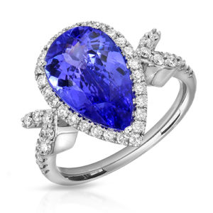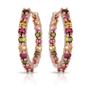
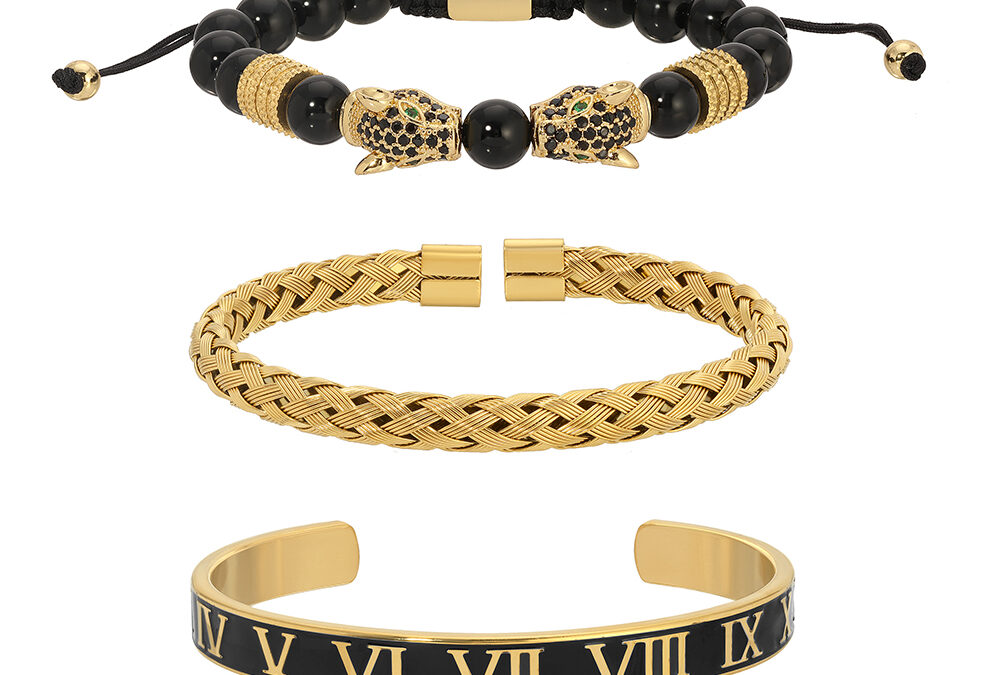
A catalog starts to look unreliable when one ring appears bright white, the next looks gray, and a third is photographed from a completely different height. Knowing how to match catalog photos means building a repeatable visual standard for lighting, camera position, crop, color, and retouching. For jewelry brands, that consistency helps shoppers compare pieces quickly and see the collection as intentional, whether it includes 20 products or 2,000.
The goal is not to make every piece look identical. A yellow-gold bracelet should retain its warmth, a diamond should show its fire, and an emerald should look like an emerald. The goal is to make every image feel as though it belongs to the same brand and the same collection.
Start With a Catalog Photography Standard
Before photographing a new collection, choose a reference set of finished images that represents the look you want to repeat. This should include your preferred background tone, shadow treatment, crop, main angle, metal appearance, and level of retouching. A single reference image is helpful, but a small group is better because earrings, necklaces, rings, and bracelets each present different lighting challenges.
For example, a clean white-background catalog may use a pure white background with a soft, controlled natural shadow below each item. Another brand may prefer a very light warm gray background that gives yellow gold more definition. Both can work. The problem begins when the treatment changes from product to product without a reason.
Your standard should answer practical questions before the shoot begins: Is the jewelry centered or slightly lower in frame? How much empty space surrounds it? Are clasps shown in the primary image? Is the hero angle straight on, slightly elevated, or a three-quarter view? These decisions reduce reshoots and keep future launches aligned with existing listings.
Match Lighting Before You Match Editing
Retouching can refine an image, but it cannot fully correct inconsistent lighting. Jewelry reflects its entire environment, so the lighting setup is the foundation of a matched catalog.
Metal surfaces need broad, carefully placed reflections that describe the shape without creating distracting hot spots. Diamonds need lighting that reveals both their overall form and their sparkle. Colored gemstones need a more measured approach because excessive contrast or bright point lights can shift apparent color, hide inclusions, or make a stone look unlike the item a customer receives.
In our Los Angeles studio, we control the size, direction, and diffusion of every light source rather than relying on a general product setup. This is particularly important when matching new products to a catalog photographed months or years earlier. The photographer should study where highlights fall across the reference pieces: along the top edge of a band, across a watch bezel, or on the facets of a center stone. Then the lighting can be recreated with intention.
A matched catalog does not always require the exact same equipment. It requires the same visual result. If an older catalog has soft, elegant highlights and restrained diamond sparkle, a new set of images should not suddenly have hard reflections and dramatic contrast just because a different lighting style is currently popular.
Use Repeatable Angles and Camera Position
Consistency in angle is one of the fastest ways to make a product grid look polished. Shoppers rely on visual repetition to compare similar designs, especially when they are deciding between stone sizes, metal colors, or variations of one silhouette.
For rings, the hero image may show the face of the ring at a slight angle that reveals both the center stone and the band. For earrings, a straight-on pair image may be the primary view, followed by a side angle that shows depth. Necklaces often need a carefully shaped position that keeps the chain natural and the pendant readable. The correct angle depends on the product, but it should remain consistent within a category.
Camera height matters as much as the direction of the piece. A ring photographed from too high can make its center stone appear smaller. A necklace photographed too close can distort chain proportions. Once an effective setup is established, record the camera height, lens choice, distance, and product stand position. This production information is what makes future catalog matching efficient rather than approximate.
Keep Crop and Scale Consistent
A common catalog mistake is allowing every product to fill the frame differently. One pendant may occupy 80 percent of the image while another occupies 45 percent, making the second one look smaller or less important even when it is not.
Set category-specific crop rules instead. Rings can have one framing standard, earrings another, and necklaces a third. Within each category, maintain a comparable visual scale while allowing room for unusually tall, wide, or delicate pieces. The right balance depends on the sales channel too. Marketplace thumbnails often benefit from a larger product presence, while a luxury brand website may use more breathing room for a quieter, editorial presentation.
If physical scale is a selling point, add a secondary image on a hand, ear, neck, or model. White-background catalog photography remains the comparison tool. On-model imagery answers a different question: how the jewelry looks when worn.
Protect Accurate Metal and Gemstone Color
Matching catalog photos is not simply an aesthetic issue. Color inconsistency can create returns, customer service questions, and loss of trust. This is especially true for yellow gold, rose gold, mixed-metal designs, fancy-color diamonds, sapphires, emeralds, and opals.
Use a controlled color workflow from capture through delivery. White balance should be set deliberately, monitors should be calibrated, and retouchers should work from approved references rather than personal preference. A warmer edit may flatter yellow gold in isolation, but it will look wrong beside a cooler image from the same collection.
Gemstones deserve particular restraint. The purpose of professional jewelry retouching is to clean dust, refine reflections, and present the stone at its best without inventing color, clarity, size, or brilliance that the item does not possess. High-end retouching should make the image feel precise, not artificial.
Create a Retouching Playbook
The finishing stage is where catalog standards become visible. Establish a retouching playbook that defines what is corrected on every image and what is left natural. It may specify dust removal, prong cleanup, background consistency, minor metal smoothing, chain shaping, and controlled enhancement of diamond brilliance.
It should also establish limits. Fine jewelry benefits from detail, including the texture and craftsmanship that prove it is real. Over-smoothing polished metal can make it look computer generated. Aggressively whitening diamonds can remove their character. Heavy shadow removal can make a piece appear to float rather than sit naturally on the page.
For growing e-commerce catalogs, a clear retouching standard also makes costs predictable. Not every image needs the same amount of detailed work. A simple sterling silver stud earring photographed in volume may need efficient catalog cleanup, while a diamond engagement ring for a luxury campaign may require more time for exact reflection control and stone-by-stone refinement. Both deserve professional handling, but the production approach should fit the item and its intended use.
How to Match Catalog Photos When the Original Shoot Is Old
Many jewelry businesses need new images to match a catalog created by another photographer or under a previous brand direction. The best starting point is to provide original high-resolution files, not only website screenshots. Screenshots can help identify the style, but they do not reveal the true background values, color decisions, or level of detail in the source file.
Send a representative sample from each product category and identify the images you consider the strongest match. It is also useful to flag examples that do not represent the direction you want to continue. If the original catalog has inconsistent images, this is an opportunity to establish a better standard instead of repeating every past variation.
A test group is often the smart choice for large or valuable collections. Photograph and retouch several pieces, review them beside the existing catalog on desktop and mobile, then approve the look before full production begins. This protects both the brand and the production schedule.
Plan Image Sets Around Where You Sell
A catalog image set should reflect the way customers shop on each channel. Your main white-background photo needs to be clear at thumbnail size. Additional views can show the side profile, back, clasp, hallmark, stone setting, or scale. For luxury collections, an on-model or lifestyle image may carry the emotional weight that a catalog image should not be asked to carry alone.
Do not force every product into the same number of images if the designs have different needs. A simple chain may need a hero image, a detail view, and a model image. A complex halo ring may need several angles to show the gallery, setting, and band. Consistency is about a logical system, not rigid repetition.
For designers and retailers with recurring launches, keep an image archive with the approved references, crop templates, lighting notes, and retouching instructions. That archive becomes a practical brand asset every time a new SKU arrives.
Work With a Jewelry-Specific Production Partner
General product photography can produce a clean image, but jewelry catalog matching requires experience with reflective metal, tiny settings, delicate chains, diamonds, and colored stones. The more valuable or visually complex the jewelry, the more that specialized control affects the result.
TN Connections Inc. photographs luxury pieces, commercial collections, loose stones, watches, and high-volume e-commerce catalogs from the Downtown Los Angeles Jewelry District. We can match an established visual system or help build one that is practical for future launches, with professional retouching and volume pricing when applicable. Local clients can bring collections to the studio, while nationwide clients can use our mail-in photography service.
If your product grid feels uneven, do not wait for a complete rebrand to correct it. Gather your strongest reference images, identify the products that need to match, and request a free quote for a test set or full catalog project. A consistent collection gives every new piece a stronger place to sell.