A jewelry catalog can lose a sale before a shopper reads the product description. A diamond that looks gray, a yellow-gold ring with harsh reflections, or a necklace photographed at a different scale from the rest of the collection creates doubt. The best catalog image improvements make each piece look accurate, desirable, and consistent enough to buy with confidence.
For jewelry brands, the priority is not simply making an image brighter or sharper. It is controlling the visual details that communicate value: metal finish, gemstone color, facet definition, proportions, clasp construction, and the way a piece sits on the body. Strong catalog photography also gives customers a dependable way to compare products across a collection.
What Catalog Image Improvements Should Accomplish
A better jewelry image should answer the questions a shopper cannot answer by holding the piece. What is the real metal color? How large is the pendant? Is the gemstone clear, richly colored, or full of visible inclusions? Is the ring setting high or low? Does the chain look delicate or substantial?
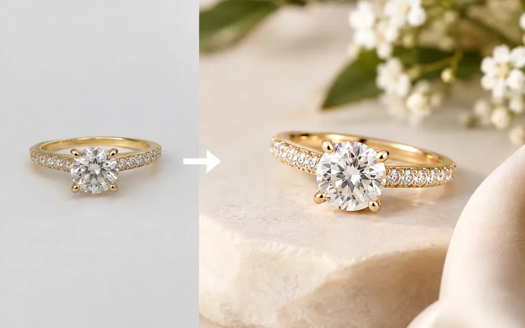
That requires more than a plain white background. White-background photography is still the foundation for e-commerce, marketplaces, wholesale line sheets, and product pages because it keeps the item central. But the image must be lit and retouched with restraint. Over-editing can erase natural facet patterns, make pavé settings look soft, or turn a warm gold alloy into an unnatural yellow.
In our Los Angeles studio, we approach catalog image improvements as a repeatable production system. Each item receives jewelry-specific lighting, careful positioning, high-resolution capture, and professional retouching designed to preserve what makes the piece real. The result can feel refined enough for a luxury collection while remaining efficient for a large commercial catalog.
Start With Accurate Light, Not Heavy Editing
Retouching can polish an image, but it cannot fully repair poor lighting. Jewelry is reflective by nature. Every polished surface can mirror a camera, a light source, the room, or an unwanted dark edge. Diamonds and colored stones add another challenge because their appearance changes quickly with the direction, size, and intensity of light.
For white metals, the goal is usually clean definition without flat gray areas. Yellow gold needs controlled warmth so it looks rich rather than orange. Rose gold must retain its subtle pink tone without drifting too coppery. Platinum, sterling silver, and rhodium finishes require contrast that reveals their shape while keeping the surface believable.
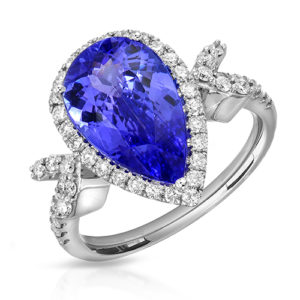
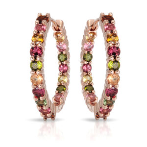
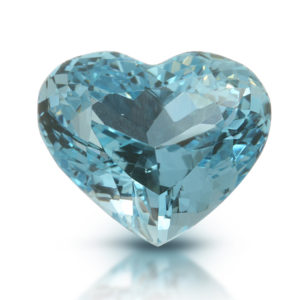
Gemstones need their own lighting decisions. A diamond needs a balance of brilliance, fire, and readable facet structure. Too much sparkle can hide the cut; too little makes the stone appear dull. Emeralds, sapphires, rubies, opals, and other colored gems must be photographed with attention to hue, transparency, and natural internal character. The right setup depends on the stone, its cut, and the sales channel. A high-jewelry campaign image may favor mood and drama, while a marketplace listing should prioritize clear, honest representation.
The angle is part of the product information
One front-facing image is rarely enough. The most useful catalog sets show the angles that explain construction and scale. For rings, that often means a straight-on view, a three-quarter view, a side profile, and a close detail of the setting. Earrings may need a pair shot, an individual view, and an angle that shows post or closure details. Necklaces benefit from a full-length view as well as a close crop of the pendant or clasp.
Consistency matters here. If every ring is framed differently, shoppers cannot compare stone size, band width, or setting height quickly. Establishing a repeatable camera angle, crop, and product position makes the entire storefront easier to browse. It also makes future additions look like they belong to the same brand.
Retouching That Refines Without Misrepresenting
Professional jewelry retouching is often mistaken for cosmetic manipulation. Proper retouching is more practical. It removes dust, fingerprints, temporary scratches, thread, wax residue, distracting reflections, and minor handling marks that do not represent the intended finished product.
It can also improve edge definition, clean the background, correct a slight color shift, and create a consistent metal finish across a collection. For stacked or multi-stone pieces, retouching helps maintain clarity so individual details do not collapse into visual noise at thumbnail size.
There is a line, however. A retoucher should not make a commercial-grade stone look internally flawless, transform a treated gemstone into a different color, or alter the apparent size of a product. Accurate images protect customer expectations and reduce the chance that a piece feels different when it arrives.
For luxury jewelry, the retouching standard is usually more exacting because macro photography reveals everything. For large-volume catalogs, the process should be streamlined with approved standards for crops, background tone, shadow treatment, and finish. Both approaches can produce excellent work. The difference is the time and precision assigned to each image.
Build a Catalog Standard Before Photographing the Collection
The fastest way to create inconsistency is to photograph products one at a time without a shared visual plan. Before production begins, define the image standard for the collection: background, crop ratio, orientation, shadow style, number of angles, metal color target, and file naming approach.
This is especially valuable for manufacturers, wholesalers, and brands with recurring launches. A well-documented standard allows a new bracelet, pendant, or gemstone style to match images produced months earlier. It also reduces approval rounds because the studio and the client are working toward the same reference.
A practical catalog standard should account for where the images will appear. Shopify product pages can support several views and detailed close-ups. Amazon and other marketplaces may have strict main-image requirements that favor a clean white background and clearly visible product boundaries. Wholesale presentations may need uniform images that place more emphasis on fast comparison than editorial styling.
If you sell across several channels, photograph the core catalog assets first, then produce additional crops or supporting content from the same setup when possible. This is usually more cost-effective than arranging separate shoots for every platform.
Add Scale Where It Changes the Buying Decision
A clean packshot explains the product. It does not always explain how the product feels when worn. Model and hand-model photography can solve that problem for rings, earrings, bracelets, watches, and necklaces where scale, drape, and personality influence the purchase.
The right choice depends on the item and the brand. A small stud earring may need an on-ear image to show proportion. A sculptural cocktail ring may benefit from a hand shot that shows its height and presence. Fine chains often need a neckline image because length and placement are difficult to understand from a flat product shot.
These lifestyle-supporting images should complement, not replace, the catalog set. Shoppers still need clean views to examine details. The strongest product pages usually combine precise white-background photography with one or two images that show scale or styling.
Know When Video Is Worth Adding
Some jewelry is better understood in motion. A 360-degree video can reveal the depth of a setting, the movement of a drop earring, the profile of a watch case, or the way light travels through a gemstone. It is particularly useful for higher-ticket pieces, statement designs, and products whose construction is difficult to see in still images.
Video is not necessary for every SKU. For a high-volume, entry-price catalog, a consistent set of well-made stills may deliver the best return. For engagement rings, watches, one-of-a-kind gemstones, or premium designer collections, motion can provide the extra reassurance a customer needs before requesting more information or placing an order.
Improve What Customers Actually See First
Many brands focus only on the large product-page image, but the thumbnail often makes the first impression. A catalog should be reviewed at search-result size, collection-grid size, and mobile size. If a delicate pendant disappears at a small scale or a pair of earrings reads as one indistinct shape, the image may need a different crop, angle, or contrast treatment.
This is where catalog consistency becomes a sales tool. When product thumbnails share scale and placement, a collection looks intentional and easier to shop. When every image varies in background brightness, color temperature, and framing, the catalog can look pieced together even when the jewelry itself is exceptional.
TN Connections helps jewelry brands, designers, wholesalers, and online sellers create catalog systems that work from a single launch to ongoing volume production. We photograph luxury fine jewelry, diamonds, gemstones, watches, and commercial collections from the Los Angeles Jewelry District, with nationwide mail-in service for clients who need a specialized jewelry photography partner. Qualifying volume work can begin at $12 per image, with scope based on the product, angles, retouching, and turnaround needs.
If your existing product pages feel uneven, begin with a small representative group: a ring, an earring pair, a pendant, and a gemstone piece. Compare the new images at mobile size beside the current catalog. The differences in color, clarity, scale, and confidence will show you exactly where the next improvement should happen.