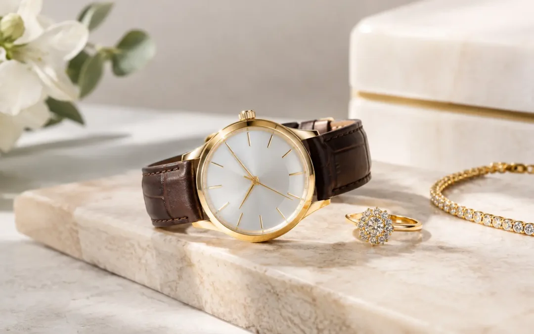
A watch can look expensive in hand and unexpectedly flat in a product image. Polished steel turns into a dark stripe, a sapphire crystal mirrors the entire set, and a beautiful sunburst dial loses its texture under one careless reflection. A practical watch photography guide starts with that reality: watch photography is not simply product photography at a smaller scale. It is precision lighting, careful styling, and retouching designed to show craftsmanship without inventing details.
For luxury brands, manufacturers, retailers, and e-commerce sellers, the goal is twofold. Shoppers need enough visual information to trust the product, while the image still needs the restraint and polish expected of a premium timepiece. The right approach depends on the watch material, dial finish, sales channel, and whether the image belongs in a high-volume catalog or a campaign.
What Makes Watch Photography Different?
A watch combines some of the most difficult surfaces to photograph: curved crystal, brushed and polished metals, reflective indices, tiny engraved details, moving bracelet links, and dials that can shift color with the light. Unlike a ring or pendant, it also has a face that must remain legible. The date window, hands, chapter ring, logo, crown, and subdials all need to appear intentional.
The main challenge is reflection control. Metal should show its shape through clean, controlled highlights, not as a featureless white glare or a dark reflection of the camera. A crystal should look clear while retaining a believable edge. A black dial should read as black, with indices and hands separated clearly enough for a shopper to inspect them.
At the same time, a watch cannot be overcorrected. Removing every reflection makes polished materials look dull and artificial. The strongest images use reflections as a design tool: a narrow highlight reveals the bezel curve, a soft gradient describes the case, and a controlled edge light separates a bracelet from a white background.
Watch Photography Guide: Start With the Sales Channel
Before setting a light, decide where the images will be used. A direct-to-consumer product page needs a consistent set of clear views. A luxury campaign may need mood, texture, and more dramatic shadow. Marketplace listings often require a simple white-background hero image that makes the product immediately recognizable at thumbnail size.
| Image style | Best use | Visual priority |
|---|---|---|
| White-background product image | E-commerce, wholesale, marketplaces | Clarity, accurate color, catalog consistency |
| Detail macro image | Product pages, premium launches | Dial texture, finishing, engraving, gemstones |
| Lifestyle or prop image | Social campaigns, lookbooks, website banners | Brand personality and aspiration |
| On-wrist image | Product pages and advertising | Scale, fit, and real-world presence |
| 360-degree video | E-commerce and product launches | Case depth, bracelet movement, overall form |
A developing brand does not always need every format. If budget is focused on a new collection, prioritize the hero image, alternate angles, a dial macro, and one scale image. For a stronger launch, add on-wrist content and video. The difference is commercial: still images answer inspection questions, while movement helps shoppers understand the object as a wearable piece.
Build the Light Around the Watch Surface
Lighting should be selected for the watch, not pulled from a generic setup. A brushed titanium case, a yellow-gold bracelet, a ceramic bezel, and a mother-of-pearl dial require different treatment.
Soft, broad sources generally create smooth gradients on curved metal, but softness alone is not enough. If the source is too large or placed poorly, the crystal can become a blank white panel. Smaller controlled reflections can define a polished bezel or bracelet link, particularly when paired with flags that create clean dark edges.
For a dial, the key is separation. The hands must remain readable against the dial surface, and applied markers should catch enough light to show their form without becoming blown-out dots. Gem-set bezels require a more active lighting pattern than smooth metal. The goal is not to make every stone flash at once, which can look chaotic. Instead, light should reveal the setting, individual facets, and the overall continuity of the stone line.
Color accuracy deserves equal attention. Rose gold can shift too orange, yellow gold can appear greenish, and blue dials can become purple or gray when the lighting and camera profile are not controlled. A calibrated workflow and consistent post-production protect the product from costly color surprises when customers receive it.
Choose Angles That Answer Buyer Questions
A single straight-on view rarely carries a watch listing. Shoppers want to see how the case sits, how deep it is, what the bracelet looks like, and whether the dial details hold up close.
For a standard e-commerce set, use four or more purposeful views:
- A front hero image that presents the dial clearly and keeps the watch symmetrical.
- A three-quarter angle that shows case depth, bezel profile, and crystal shape.
- A side or crown view that reveals thickness, pushers, crown guards, or case finishing.
- A bracelet, clasp, or strap view that shows construction and material.
- A tight macro of the dial, engraving, gemstone setting, or texture when those features support the selling story.
The hands should be positioned thoughtfully. A common display position can frame the logo and date window, but there is no universal rule that works for every dial layout. On chronographs and skeleton watches, we evaluate the composition so subdials, openwork, and branding remain visible rather than obstructed.
Scale is another frequent omission. A watch can look substantial in a close crop but feel much smaller on the wrist. An on-model or hand-model image resolves that uncertainty, especially for slim dress watches, oversized cases, women’s styles, and unisex collections. Models also give a campaign warmth, but styling should support the brand rather than distract from the timepiece.
Styling and Preparation Save Retouching Time
Professional retouching is essential in watch photography, but it should refine a carefully prepared product rather than rescue a rushed one. Before photography, remove protective films, dust, fingerprints, tag strings, and packaging residue. Inspect the crystal and case under direct light. Small marks that disappear in normal handling can become obvious at macro resolution.
Bracelets need particular attention. Links should sit naturally and symmetrically, while leather straps need enough shape to look worn-in without creasing awkwardly. If a watch is photographed flat, the arrangement should still suggest its intended form on the wrist. Invisible supports and careful positioning help maintain that shape.
For a collection, establish details before the first watch is photographed: dial angle, scale in frame, shadow density, background value, hand position, and crop. Recreating consistency later is more difficult than building it into the shot list from the start.
Retouching Should Clarify, Not Misrepresent
High-end watch retouching removes distractions while preserving what the buyer is paying for. Dust, tiny handling marks, unwanted set reflections, and temporary supports can be cleaned. Multiple exposures may be combined to show the dial, metal, and crystal at their best in the same final image.
What should not happen is misleading alteration. A retoucher should not change the dial color, hide meaningful wear on a pre-owned watch, add stones, reshape a case, or erase manufacturing features that a buyer will see in person. Accurate retouching builds trust, especially for luxury and collectible pieces where shoppers scrutinize every detail.
For catalogs, retouching also creates visual continuity. A white background should look consistent across steel, gold, black ceramic, and leather straps. That does not mean every watch should have identical lighting. It means each image should belong to the same brand system while respecting the materials in front of the camera.
When Video Adds More Value Than More Stills
A 360-degree watch video is especially useful when the case architecture, bracelet construction, or gemstone detail is part of the purchase decision. Rotation shows the relationship between the crystal, bezel, lugs, caseback, and band in a way that still images cannot fully communicate.
Video also works well for social media launches, but it needs the same discipline as a still image. Fast movement, busy music-driven edits, and random reflections can make a premium watch feel less premium. A clean rotation, a controlled close-up of the crown or dial, and a short wrist shot often create more confidence than a crowded montage.
Work With a Jewelry-Focused Production Team
In our Downtown Los Angeles studio, TN Connections photographs watches with jewelry-specific macro lighting, controlled reflection work, high-resolution retouching, and catalog systems built for both premium collections and volume e-commerce needs. We can match an established image style, create a fresh art direction for a launch, or produce clean, consistent product photography for recurring inventory. Local clients in the Los Angeles Jewelry District and across Southern California can work with us directly, while nationwide mail-in projects receive the same careful handling and production planning.
A quote should be based on the real scope: number of watches, required angles, dial and material complexity, retouching level, model or lifestyle needs, and whether video is included. Qualifying volume projects can benefit from pricing starting at $12 per image, while highly art-directed luxury work is quoted for the level of lighting and finishing it requires.
If your watches are technically well made, the photography should make that quality easy to see. Request a free quote with your collection size, intended sales channels, and a few reference images, then build a shot plan that gives customers a reason to look closer.